|
|
|
|
|
|
|
 Posted: Tue Aug 03, 2010 7:43 pm Posted: Tue Aug 03, 2010 7:43 pm
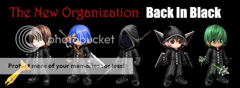
A hand-made, by me, Flyer! (This is just the beta and would love feedback/suggestions) Feel free to use here is the code(minus the spaces in th brackets):
[ url=http://www.gaiaonline.com/guilds/id.231099 ][ img ]http://i983.photobucket.com/albums/ae315/Albinoghost/TNOFlyer.jpg[/img][ /url ]
|
 |
|
|
|
|
|
|
|
|
|
|
|
|
|
Posted: Tue Aug 03, 2010 8:16 pm
I think it is good work. My suggestion to you, even though I have never used gimp and I am not sure if it works like Photo Shop in this sense, is that you set up a layer and make that your back ground color. Then you make the words another layer. Then when you import the TekTek avatars, they should be in the PNG format if you get them from my profile, simply drag the pictures from that window on to your work space. That would cut down the scraggly edges on the pictures and simply give you a clean cut. That will help you quality wise. That is if Gimp works like Photo Shop in that sense.
|
|
|
|
|
|
|
|
|
|
|
|
|
|
|
|
|
|
Posted: Tue Aug 03, 2010 8:20 pm
Sadly Gimp doesn't process the color pallet of .png well, i tried that at first, to import them all as layers into a new image. It turn out all discolored like dark blue robes and my hair was yellow and just all screwy. So i had to take them to Paint shop and save them as jpg's then import them, and i was in the process of manually cleaning up the edges when i got the idea to upload the beta phase just to have something to get some criticism on.
|
|
|
|
|
|
|
|
|
|
|
|
|
|
|
Posted: Tue Aug 03, 2010 8:22 pm
My suggestion is more about making actual characters more uniform. You should probably use flip and have the left ones facing left and the right ones facing right. Also, to make it more uniform I would probably use the Galexgan with no aura, and everyone having thier weapon out (Hanxtan and Kotalax).
Also, I feel Kexly would be more suiting than Xandraxan. Just as a personal preferance.
|
|
|
|
|
|
|
|
|
|
|
|
|
|
|
|
|
|
Posted: Tue Aug 03, 2010 8:24 pm
I was wondering about which 5 to use, and I was planning on getting a no aura Galexgan soon. so, It will be done!
|
|
|
|
|
|
|
|
|
|
|
|
|
|
|
Posted: Tue Aug 03, 2010 8:25 pm
If you want suggestions then I would say give us a background. This is the background I was talking about earlier today.  Go to that link.
|
|
|
|
|
|
|
|
|
|
|
|
|
|
|
|
|
|
Posted: Tue Aug 03, 2010 8:27 pm
Astrixinch My suggestion is more about making actual characters more uniform. You should probably use flip and have the left ones facing left and the right ones facing right. Also, to make it more uniform I would probably use the Galexgan with no aura, and everyone having thier weapon out (Hanxtan and Kotalax). Also, I feel Kexly would be more suiting than Xandraxan. Just as a personal preferance. Am I sensing a bashing of Xandraxan?
|
|
|
|
|
|
|
|
|
|
|
|
|
|
|
Posted: Tue Aug 03, 2010 8:29 pm
Hanxtan If you want suggestions then I would say give us a background. This is the background I was talking about earlier today. Thanks biggrin i had been searching for that Xp
|
|
|
|
|
|
|
|
|
|
|
|
|
|
|
|
|
|
Posted: Tue Aug 03, 2010 8:32 pm
Hanxtan Astrixinch My suggestion is more about making actual characters more uniform. You should probably use flip and have the left ones facing left and the right ones facing right. Also, to make it more uniform I would probably use the Galexgan with no aura, and everyone having thier weapon out (Hanxtan and Kotalax). Also, I feel Kexly would be more suiting than Xandraxan. Just as a personal preferance. Am I sensing a bashing of Xandraxan? No, but which would you think better represents our order? A guy who controlls rocks (Dirt) Or a guy who controlls darkness (The ultimate force of evil in the universe)?
|
|
|
|
|
|
|
|
|
|
|
|
|
|
|
Posted: Tue Aug 03, 2010 8:33 pm
Kotalax Hanxtan If you want suggestions then I would say give us a background. This is the background I was talking about earlier today. Thanks biggrin i had been searching for that Xp No problem. I think if you can apply that then we will definitely have an awesome Guild Sign. M suggestion is to first remove the original organization characters and fill in the back ground that is missing. That will be the hardest part of the whole thing, so I say do it first.
|
|
|
|
|
|
|
|
|
|
|
|
|
|
|
|
|
|
Posted: Tue Aug 03, 2010 8:34 pm
Astrixinch Hanxtan Astrixinch My suggestion is more about making actual characters more uniform. You should probably use flip and have the left ones facing left and the right ones facing right. Also, to make it more uniform I would probably use the Galexgan with no aura, and everyone having thier weapon out (Hanxtan and Kotalax). Also, I feel Kexly would be more suiting than Xandraxan. Just as a personal preferance. Am I sensing a bashing of Xandraxan? No, but which would you think better represents our order? A guy who controlls rocks (Dirt) Or a guy who controlls darkness (The ultimate force of evil in the universe)? You make a good point, sorry Xandraxan. . . he makes a good point. sweatdrop
|
|
|
|
|
|
|
|
|
|
|
|
|
|
|
Posted: Tue Aug 03, 2010 8:37 pm
Astrixinch kinda has a point, but by that logic i should also remove myself, Hanxtan, and Galexgan esspecialy (Solar bad guy?), and add Xevie. Leaving it as Manipulation(Xevie), Deciet(Astrixinch), and Darkness(Kexly). {{I kinda have to admit, if everyone understood what their elements were and what they represented that would be a DANG good sign...}}
|
|
|
|
|
|
|
|
|
|
|
|
|
|
|
|
|
|
Posted: Wed Aug 04, 2010 4:00 am
 Well this what I was able to do with Photo Shop. I found it pretty simple. Maybe you should use Photo Shop, if you would like a copy of Photo Shop CS4 Portable let me know. Well this what I was able to do with Photo Shop. I found it pretty simple. Maybe you should use Photo Shop, if you would like a copy of Photo Shop CS4 Portable let me know.
|
|
|
|
|
|
|
|
|
|
|
|
|
|
|
Posted: Wed Aug 04, 2010 5:07 pm
Here is the new flyer (in sig) and code:
[ url=http://www.gaiaonline.com/guilds/id.231099] [ img]http://i983.photobucket.com/albums/ae315/Albinoghost/TNOFlyeralphatesting.jpg[/img]
I'm quite proud of the deletion of the original Org. XIII members (Clone is a marvelous tool biggrin )
|
|
|
|
|
|
|
|
|
|
|
|
|
|
|
|
|
|
Posted: Thu Aug 05, 2010 5:34 am
Here's mine.  My only concerns are that Mitternaght and Kotalax's sword might be overlapping too much, and the "I"s in the font are kinda hard to read.
|
|
|
|
|
|
|
|
|
|
|
|
|
|