|
|
|
|
|
|
|
|
|
 Posted: Sun Nov 11, 2007 4:31 pm Posted: Sun Nov 11, 2007 4:31 pm
|
|
|
|
|
|
|
|
|
|
Posted: Tue Nov 13, 2007 8:20 pm
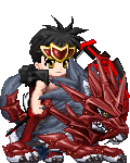
Hmmm... How harsh a critique are you wanting?
1.) Don't use the lens flare with this. It doesn't make any sense with where it's positioned and the shading elswhere makes it stand out too much.
2.) Work on celaning up your lineart. Keeping it light like that looks a bit sloppy. Taking the time to really make it dark and smooth truly pays off in the long run. biggrin You can do it!
3.) Her eyes look funny... Look at other eye examples and really study them. Look at how they draw the pupils and the irises, including the shading and the highlights. The more you observe, the more you can apply, the better your pic will become.
4.) There really needs to be more shading in general. It looks like you have just the flat colors on here. Now, go to your palette and choose some color that are darker than the shades you have here, and some lighter. Play with it and be sure to stay true to your lightsource!
5.) Her pose seems pretty stiff. I know hands are hard to draw, and that body positions can be a pain. But really, look and observe people, to see what makes them look relaxed, what makes them look like someone just poked them in the back with a pin, etc. Go out and find pictures of characters and people in similar poses and try to mimic the body language.
Don't take any of this as though I don't like the picture. I think with some practice, you will do just fine. biggrin
|
 |
|
|
|
|
|
|
|
|
|
|
|
|
|
|
|
|
Posted: Tue Nov 20, 2007 10:37 pm
I'd have to agree with euclids on the last part.
Since you're playin' around with Photoshop, there're a few tips and tricks that'll probably help you out a lot...depending on which version you're using. There's a cheapo version that doesn't have all the tools I'm used to, (I work with PS7), so if you can't find something, don't worry about it. If you need me to, I can always just throw together a simple tutorial for ya.
I'm gonna follow euclid's list to make things a little easier to follow, an if I start sounding like I'm treating you like an idiot, I'm sorry. Text alone does not a good tutorial make. sweatdrop
1. If you're gonna use a lens flare, wait until you're all finished with everything else, and you've flattened the image. I'd imagine that what happened there was that you wanted the lense flare, but one of PS's little quirks is that it will only put a lense flare on a layer, and it'll only show up on whatever was on that layer (looks kinda like it was her hair, I'm not seein' the flare crossing over your linework.) Visual FX always have to be the last step.
To flatten an image, just go to the little arrow pointing to the right on your layers palette. When you click on it, it'll bring up a drop menu, just click on Flatten Image or Merge Visible (if you've already got a background, or something, that'll make things a little easier.)
2. Euclid's got a point there. There are two processes that will probably help out a great deal. Before you start adding color, or anything else, make sure that you've got your linework layer selected, and then go to your top menu, and click Image>Adjustments>Levels. Play around with the arrows you find there until your lines look like a good, solid black...or white, or whatever you want. (I've seen people do some really funky, but really cool things with grey lines eek )
Your linework will probably look a lot cleaner once it's been resized. The smaller it is, the harder it is to pick out flaws in the lines, but the harder it is to put in a lot of detail. Since it looks like you've got an image file, just open that file up in PS, then go to Image>Image Size, and type in 600 pixels in the width area. As long as the Constrain Poportions tab is checked while you're there (and it should be, as a default setting) then you won't end up with some strangely sized image. Then just save your changes to the image and that's all you need to do!
3. Umm...yeah. I'm really not sure how to help ya out there...Eyes are the one thing people pick up on really fast, it's where tey look first. As long as the eyes come acrss like they might belong to a real person (and there's literally an endless variety of ways to do that! ) then you can pretty much do anyting else you want.
4. Uh, yeah. More shading. A good way to get your basic shadow colors is to take your Burn tool (it'll look like a hand picking up a grain of salt, or something, in your tools palette) and just pass it over a color a few times to darken it a bit. Then you can take your Eyedropper tool to sample that new color, and paint it in with the Brush tool.
Same process for highlights, but instead of the Burn tool, you'll need the Dodge tool. Just lick and hold on the Burn tool until it brings up a little side menu, and then select the one that looks like a blue lollipop.
Photoshop is just like art, the more you practice with it, the easier it gets, and the better you get with it.
|
|
|
|
|
|
|
|
|
|
|
|
|
|
|
Posted: Sun Nov 25, 2007 3:23 pm
first time using guys, have no idea what im doing
|
|
|
|
|
|
|
|
|
|
|
|
|
|
|
|
|
|
Posted: Sat Dec 01, 2007 3:04 pm
mermaid_melody07 first time using guys, have no idea what im doing That would be why I posted some tips for ya. mrgreen Em...wait...that came out wrong.... sweatdrop Remember, if a tutorial is what you need, I can either make one up for ya, or I can direct you to several sites that have more comprehensive ones. They'd all require free registration, though, before you could access the tuts.
|
|
|
|
|
|
|
|
|
|
|
|
|
|
|
|
|
|