|
|
|
|
|
|
|
 Posted: Sat Feb 16, 2008 11:48 am Posted: Sat Feb 16, 2008 11:48 am
x o x o x o x o x o x o
I'm not that great. But I'm not too bad either. Agreed?
|
 |
|
|
|
|
|
|
|
|
|
|
|
|
|
Posted: Sat Feb 16, 2008 12:13 pm
I cant say anything on this one, I've no clue what a good photograph composition is. but it is annoying that everything is a link with you.
I was too lazy to look at 'em all, are they all black and white?
|
|
|
|
|
|
|
|
|
|
|
|
|
|
|
|
|
|
Posted: Sat Feb 16, 2008 10:58 pm
i have to agree with WIll on this one, i really dont know a lot of photography to say anything, just the last ones were a bit out of focus and maybe some color?
|
|
|
|
|
|
|
|
|
|
|
|
|
|
|
Posted: Sun Feb 17, 2008 8:27 pm
I like the first one and the bridge the best.
A bit more focus would be good. I love sharp images.
Also, if you could work on getting more contrast between the black & white... The lightest color in the photos isn't quite white, and the darkest color isn't quite black. I'm not quite sure how you'd go about that.. but yeah sweatdrop
<3
|
|
|
|
|
|
|
|
|
|
|
|
|
|
|
|
|
|
Posted: Mon Feb 18, 2008 1:58 pm
You can easily adjust the threshold levels in photoshop to help make the balck and whites dominant =D
|
|
|
|
|
|
|
|
|
|
|
|
|
|
|
Posted: Tue Feb 19, 2008 5:19 pm
True, true.
I lyke links. Links are the best.
They're all black and white.
You're right about the whole out of focus thing.
I never really thought of the b/w part, though.
I could use photoshop, but since we use film, it's harder to do so.
I guess I could increase the magenta when I'm enlarging.
whee
The bridge one had a full moon over it, but it didn't show up after I scanned it. T'was nice.
:3
|
|
|
|
|
|
|
|
|
|
|
|
|
|
|
|
|
|
Posted: Fri Feb 22, 2008 7:53 am
Actually to make the blacks more of a true black you use 40% cyan =D or so my teacher says
|
|
|
|
|
|
|
|
|
|
|
|
|
|
|
Posted: Sun Feb 24, 2008 12:40 pm
Really?
My teacher told us that upping the magenta to more than 50 makes the whites whiter and the blacks blacker.
whee
Different enlargers?
|
|
|
|
|
|
|
|
|
|
|
|
|
|
|
|
|
|
Posted: Sun Feb 24, 2008 11:43 pm
I like 2, 5, 6, 7, and 8 the best.
#9 (that's the one at the race track, ne?) expresses the speed of the race.
#11 and 12 aren't bad, either.
|
|
|
|
|
|
|
|
|
|
|
|
|
|
|
Posted: Tue Feb 26, 2008 4:43 pm
thx, Cap.
: )
THERE ARE MORE NOW!
Studio pictures. They're pretty awesome.
The theme was 'Far Out And Funky' I think that I hit the jackpot, hmm?
I found a more creative way to link stuff. It takes a billion more years to make (<--exageration, plz), but it looks awesome.
And it's still links.
>: D
|
|
|
|
|
|
|
|
|
|
|
|
|
|
|
|
|
|
Posted: Wed Feb 27, 2008 3:54 pm
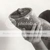
what are you holding in that first picture O_o an arm??
|
|
|
|
|
|
|
|
|
|
|
|
|
|
|
Posted: Thu Feb 28, 2008 8:27 pm
Whoops.
I forgot to mention that that was Candee.
whee
Yes, it was an arm. We took a manikin apart, and we used it's arm.
It was pretty darnded cool.
|
|
|
|
|
|
|
|
|
|
|
|
|
|
|
|
|
|
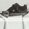
Posted: Mon Apr 07, 2008 2:14 am
Nice batch. Behold the sacred shoe! Bow down and worship its fragrance!
|
|
|
|
|
|
|
|
|
|
|
|
|
|
|
Posted: Wed Apr 09, 2008 6:51 pm
capcartoonist Nice batch. Behold the sacred shoe! Bow down and worship its pundgent fragrance! yup yup. I like this batch. especialy the first one.
|
|
|
|
|
|
|
|
|
|
|
|
|
|
|
|
|
|
Posted: Wed Apr 30, 2008 8:08 pm
~♠♣♥♦~
Ooo! New assignment!
(After weeks of doing nothing)
Macro is this one. It's where you go super close up to stuff.
I picked flowers because I'm that creative.
They turned out quite nicely. I even boosted the contrast for you guys. Not very well though, because I just did it to what I thjought looked good. And photobucket doesn't seem to like contrast that much. So the plants look a but translucent. But other than that...
; )
L I N K I N G is the best.
>: )
<3
|
|
|
|
|
|
|
|
|
|
|
|
|
|