Welcome to Gaia! ::

Heavenly Perverse

Back to Guilds


Tags: Debate, Perverse, Alternative, General 

Reply The Art Gallery
The pie's work of artz! Goto Page: 1 2 [>] [»|]

Quick Reply

Enter both words below, separated by a space:

Can't read the text? Click here

Submit

theonlypie
Crew

PostPosted: Thu Feb 28, 2008 8:27 am


Welcome to a few of my works. I finally got around to uploading a few of my projects as a jpeg, and I finished up a few of my non-logo related projects at school so I shall show some off. There isn't many to show off at the moment as i recently misplaced my sketchbook D=

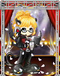
Anyways, my name is Amanda and as for my work, I tend to combine analog methods (sketchs and what have you) and computer software (mostly to color and sharpen the look of the work) to create the pieces. With my school work, I create a lot of logos and have to recreate a lot of projects (for example the Dr. Mario piece) from scratch.

Anyways, here you are!

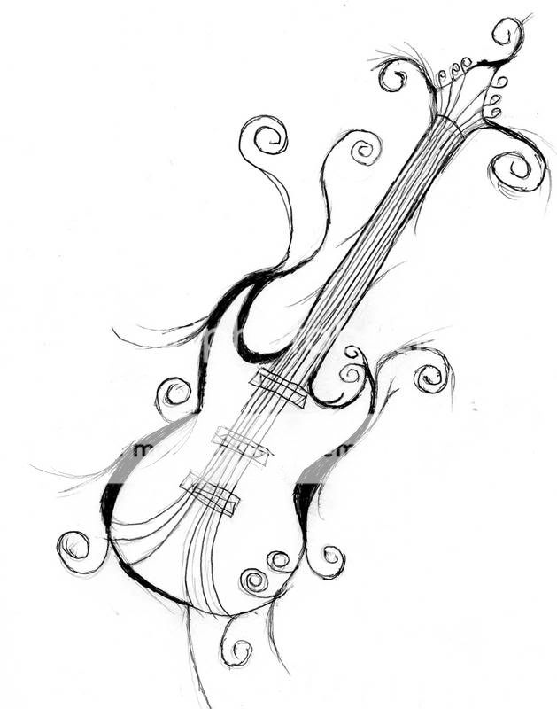
Project: Guitar Tattoo Design
All About it: A friend of mine wanted me to draw up a design for a tattoo he wanted to get. He wanted a design that was simple to replicate yet have hints of tribal influence. He also wanted a guitar obviously =d It looks a lot better in my sketch book since the scanner here blows chunks.
Materials: a pen =d
Sidenotes: the tattoo turned out great =D if i had a picture of it i would show you.
User Image

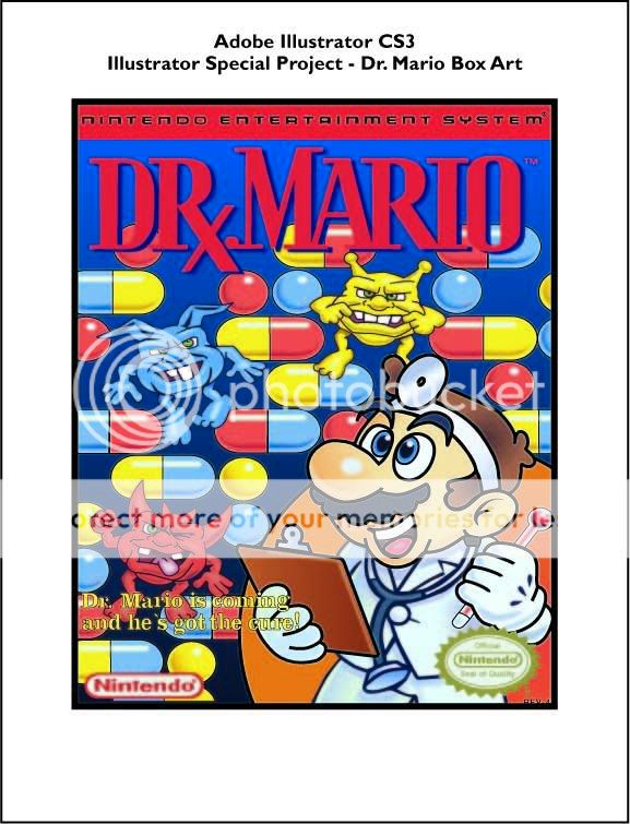
Project: Adobe Illustrator CS3 special project - Dr. Mario Box art
All About it: This is one of my school projects. The assignment was to choose whatever we like to replicate in Illustrator using everything we learned without any assistance or tracing. I'm quite happy with how it turned out =)
Materials: Adobe Illustrator CS3
Side Notes: Dr. Mario box art copyright to nintendo =)
User Image

Project: Corel X3 Special Project - Turtle
All About it: Yet another school assignment that I'm quite please turned out great. This assignment, was excatly like the Illustrator one, to replicate an image using Corel X3 using what we learned without assistance. The original image is a photograph from istock and the Telus logo and ad was added in as a bit of an extra bit my classmates said I should add on.
Side Notes: Telus Logo copyright to Telus =d (note the ad itself is not a real ad, I just used the turtle image I made and looks at a few telus ads to make the image look like a telus advertisement)
User Image

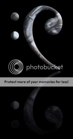
Project: Symphony of Slaughter logo
All About it: This was a personal work I did for DioRTe. The concept was to create a logo for his band in progress =d The logo in mind had to be simple yet unquie. As you can see, the request was to create a logo that combined the word Symphony (which is why the treble cleft was used) and it was also requested (at the time) to put in hints of tribal influences. This is the first draft of the logo, the next is to use H.R. Giger influences (should be done.. soon??? O_o)
Materials: Hand sketch + Adobe Illustrator to color and sharpen the over all image
User Image

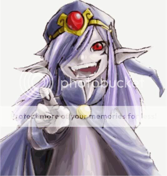
Project: Vaati Drawing
All About it: I like vaati from Legend of Zelda: The Minish Cap =d Thats about it =d He looks kinda evil though; then again, he IS the bad guy. Personal work, no relation to school or anything
Materials: Hand sketch + Adobe Illustrator to color and sharpen (though it looks pixalate in the picture =d)
Sidenotes: Vaati copyright of nintendo =)
User Image
PostPosted: Fri Feb 29, 2008 3:17 pm


I also failed to mention I also did the giant picture when you first come into HP =D

theonlypie
Crew


capcartoonist

PostPosted: Sun Mar 02, 2008 3:30 am


Wow, that's an awful lot of pie....


biggrin


Great stuff. Let's see some more.
PostPosted: Sun Mar 02, 2008 8:42 am


I like the last one especialy, cause he's all like "I'm better than you because I have pointy ears! So I'mm'a laugh now!"

Willhellm
Captain


capcartoonist

PostPosted: Sun Mar 02, 2008 10:37 pm


Willhellm
I like the last one especialy, cause he's all like "I'm better than you because I have pointy ears! So I'mm'a laugh now!"


Yeah, that's a good one. biggrin
PostPosted: Mon Mar 03, 2008 5:48 am


Thanks for the comments =D That last one turned out more "scratched" on the outline then i'd like it to be.. silly scanner and bezier tool in illustrator..

theonlypie
Crew


DioRte

PostPosted: Tue Mar 04, 2008 4:08 pm


ADORABLE TURDL!!!
PostPosted: Tue Mar 04, 2008 7:15 pm


so getting me marks back on the turtle peice and the dr.mario piece:

Dr.Mario = 95% all i got off was the fact i could have used an em dash in the top text instead of an en dash, and i forgot to cut off a bit of strips off my presentation layer.

Turtle = 65%... apparently i didnt put in enough shadows and highlights in the turtle, and also i didnt do well enough on my presentation itself, which was in a folder and with tissue paper and mylar on it.. with a nice label >__< my teacher is messed

though im proud of my dr.mario as i did a bit more work on it =D

theonlypie
Crew


DioRte

PostPosted: Sat Mar 15, 2008 2:23 pm


Your teacher obviously neglected the fact that the turtle is ******** adorable -_-;
PostPosted: Sat Mar 15, 2008 9:30 pm


I like the turtle as is, though! It's all pretty paint-y.

But, going with the Telus setup where they try to make their CG'd and Photoshop'd animals still look real, I suppose there's SOME justification in the 65%. Remove the Telus-related concept and there's no justification whatsoever for that mark.
I wouldn't necessarily give it 95, but I wouldn't give the Dr. Mario 95 either sweatdrop The slogan-text is on too busy of a background, and both the Nintendo symbol & seal are a bit too blurred.

CS3 has delicious "live trace" that makes resizing exponentially less blurry.

<3

KazeRin

Hopeless Dreamer

11,500 Points
  • Generous 100
  • Tipsy 100
  • Risky Lifestyle 100

theonlypie
Crew

PostPosted: Mon Mar 17, 2008 11:13 am


it looks burred because its in a jpeg format therefore lossy =d and when it uploaded, it looked brighter than it does on the monitor.

and i did my turtle as a flat image, i guess i could have added some dimension.

and if i traced it, it would be cheated =D
PostPosted: Tue Mar 18, 2008 7:55 am


The Nintendo logos?

<3

KazeRin

Hopeless Dreamer

11,500 Points
  • Generous 100
  • Tipsy 100
  • Risky Lifestyle 100

theonlypie
Crew

PostPosted: Wed Mar 26, 2008 3:09 pm


yeah it was made in a vector based program and when transformed into a jpeg its natural to lose its compression and turn into pixels. Hence why it looks blurred on here.
PostPosted: Tue Apr 01, 2008 11:13 pm


wow eek i have to say that the tribal treble cleft is my favorite heart heart heart

pineapple07

Tipsy Prophet

7,400 Points
  • Heckler 50
  • Risky Lifestyle 100
  • Bunny Spotter 50

theonlypie
Crew

PostPosted: Wed Jun 11, 2008 7:44 pm


NEW PIECE!! User Image
Project: Audioclone Logo
All About it: just like the treble cleft logo above, this one one is a work I did for DioRTe when he changed the name of the band to Audioclone, therefore a new logo had to reflect the new name of the band d= So this is a new one! With a hint of H.R. Giger influence included =D
Materials: Hand Sketch + Adobe Photoshop
Reply
The Art Gallery

Goto Page: 1 2 [>] [»|]
 
Manage Your Items
Other Stuff
Get GCash
Offers
Get Items
More Items
Where Everyone Hangs Out
Other Community Areas
Virtual Spaces
Fun Stuff
Gaia's Games
Mini-Games
Play with GCash
Play with Platinum