|
|
|
|
|
|
|
|
|
 Posted: Fri Oct 03, 2008 6:44 pm Posted: Fri Oct 03, 2008 6:44 pm
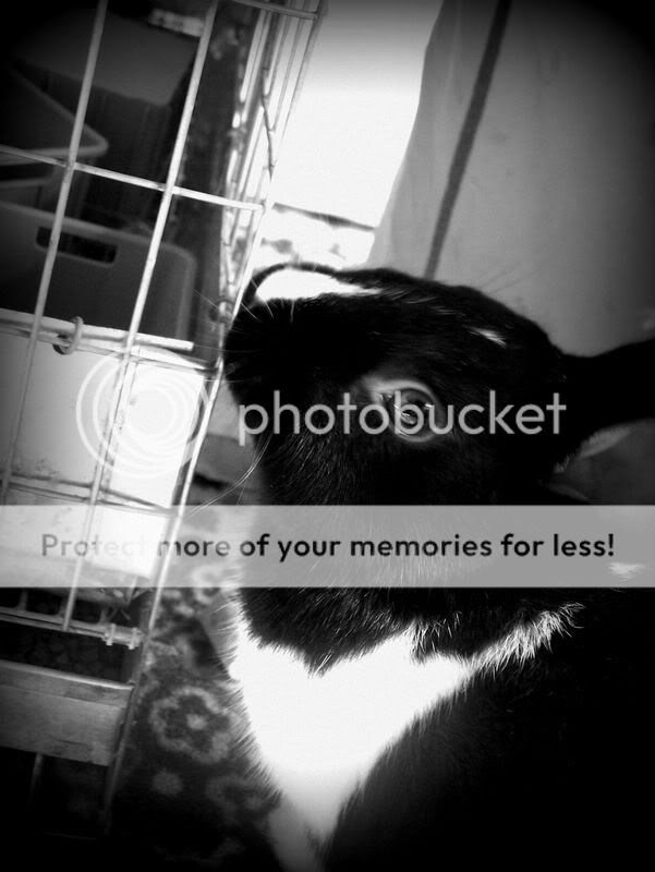
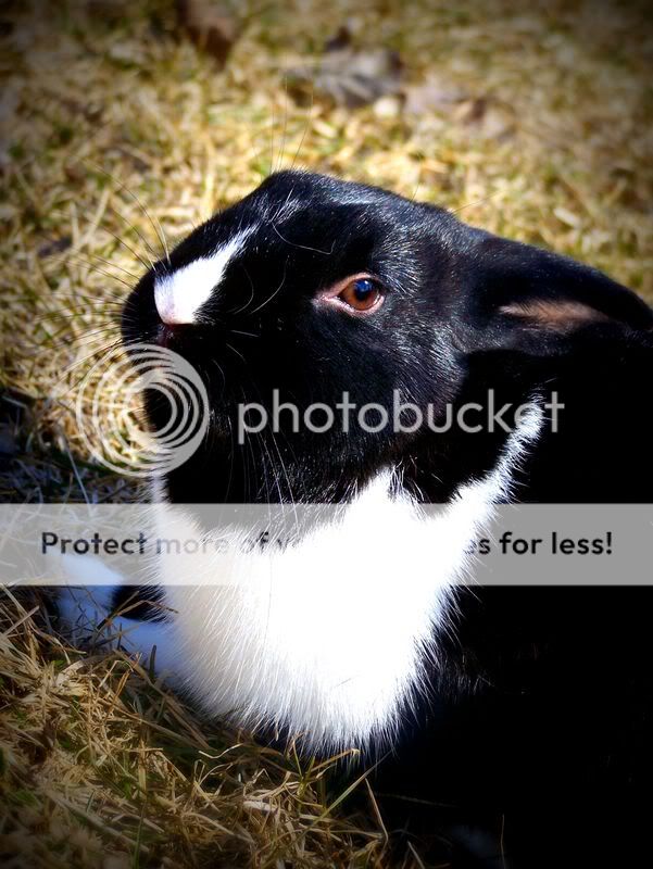
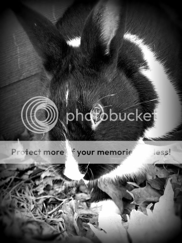
Hey everyone! It's been awhile since I've been on, but I'm going to try and change that. I was bored the other day so I went through and worked on some of my photos to try and fix them up. Please critique and tell me what you think! Thanks!     *Edit* Sorry, my computer was being stupid for some reason, the problem has been fixed though! xp
|
 |
 |
|
|
|
|
|
|
|
|
|
|
|
|
 Posted: Sat Oct 04, 2008 12:28 pm Posted: Sat Oct 04, 2008 12:28 pm
|
|
|
|
|
|
|
|
|
|
|
|
|
 Posted: Sun Oct 05, 2008 9:15 am Posted: Sun Oct 05, 2008 9:15 am
Ahhhh! So cuteee~! >w<
Ahem, anywayyy, I really like the second one. The colors make the bunny stand out. I also kinda like how the bunny looks scared in the last one. Very nice though.
|
 |
 |
|
|
|
|
|
|
|
|
|
|
|
|
 Posted: Sun Oct 05, 2008 10:24 am Posted: Sun Oct 05, 2008 10:24 am
#1 The cage behind looks creepy. eek
#all
The rabbit is messed with background. The bright and dark spots are there and here. The animal vanish in it. A simplest bg would be good for this rabbit. May be on pure white (paper or something) it would be more pop.
And composition... Rabbit - it's not only head. And a rabbit head is not so interesting by itself. Where is ears? Where is the 'visit card' of bunnies? Are present good only at third and looks like they not matter (head by center, ears are cutted).
|
 |
 |
|
|
|
|
|
|
|
|
|
|
|
|
|
|
|
 Posted: Sun Oct 05, 2008 11:10 am Posted: Sun Oct 05, 2008 11:10 am
Okay, thank you Keeper of the Cheerios, and I'll definitely keep your advice in mind lince-x!
|
 |
 |
|
|
|
|
|
|
|
|
|
|
|
|
 Posted: Mon Oct 13, 2008 1:50 pm Posted: Mon Oct 13, 2008 1:50 pm
Vignetting can be a really cool effect when used well, and I can't say it's been used well here.
When taking your photos, and doing the editing after, try to think about what you want your photo to say.
For me, vignetting speaks of something a little creepier, something darker and more sordid. It gives a dark atmosphere to the photo.
Which is why it's inappropriate here in my opinion. You're shooting sweet, cute bunnies on a sunny day. All that shadow around the edges takes away from the entire theme of the photos.
Also 1 & 3 are out of focus, all of them are over-contrasted and have harsh shadows, and the composition is really thoughtless. Your angles are all over the place, horizons are crooked, and with the exception of #4, you cut off parts of your main subject.
Keep the subject in the frame. Stay away from vignetting for now. Don't play with the contrast slider so much.
Other than that these are alright; not the worst I've seen but you could do better.
|
 |
 |
|
|
|
|
|
|
|
|
|
|
|
|
|
|
|
 Posted: Sat Jan 10, 2009 2:31 pm Posted: Sat Jan 10, 2009 2:31 pm
|
|
|
|
|
|
 |
|
|
|
|
|
|
