|
|
|
|
|
|
|
|
|
 Posted: Tue May 19, 2009 2:27 pm Posted: Tue May 19, 2009 2:27 pm
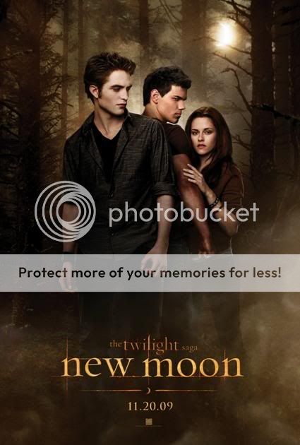 I'm a bit dissapointed, I think some fan ones are much better, but this one's not too bad. I just think it could've been better. I'm a bit dissapointed, I think some fan ones are much better, but this one's not too bad. I just think it could've been better.
What do you guys think?
|
 |
|
|
|
|
|
|
|
|
|
|
|
|
|
Posted: Tue May 19, 2009 3:17 pm
It's an interesting poster, I tell you that but I think it could have been done better.
|
|
|
|
|
|
|
|
|
|
|
|
|
|
|
|
xXserenitys-smileXx Vice Captain
|
Posted: Wed May 20, 2009 2:04 am
It's better than what wat I originally thought it would be.
Those Twilight posters were awful (except for the one that had Laurant, Victoria and James).
|
|
|
|
|
|
|
|
|
|
|
|
|
|
|
Posted: Sat May 23, 2009 12:26 pm
I agree, I'm not impressed.
|
|
|
|
|
|
|
|
|
|
|
|
|
|
|
|
|
|
Posted: Sat May 23, 2009 11:51 pm
This is soooooooooooooooooooooooooooooo good!!!!!!!!!!!!
kidding.... it ok
|
|
|
|
|
|
|
|
|
|
|
|
|
|
|
Posted: Sun May 24, 2009 9:15 pm
It's not that great, could have been better. It's OK.
|
|
|
|
|
|
|
|
|
|
|
|
|
|
|
|
|
|
Posted: Mon May 25, 2009 8:45 am
it ok it would have been better if Edward wasn't theair...
|
|
|
|
|
|
|
|
|
|
|
|
|
|
|
Posted: Mon May 25, 2009 6:09 pm
Its not the best they've done but not the worse either*shutters at the thought* I think Edward needs to be more in the back and less focal and center.....the story really is about bella and jacob!
|
|
|
|
|
|
|
|
|
|
|
|
|
|
|
|
|
|
Posted: Mon Jun 01, 2009 4:04 pm
It's alright.. already better than Twilight's movie poster. I think this one is supposed to have more symbolism in it, though. As in, Jacob is getting in between Edward and Bella.
Although, I think symbolizing this would be better fitting for Eclipse, though.
|
|
|
|
|
|
|
|
|
|
|
|
|
|
|
Posted: Thu Jun 11, 2009 4:37 pm
i agree, i think that edward shouldn't be fully there but not completely not there sorta faded.and then jacob and bella together.
|
|
|
|
|
|
|
|
|
|
|
|
|
|
|
|
|
|
|