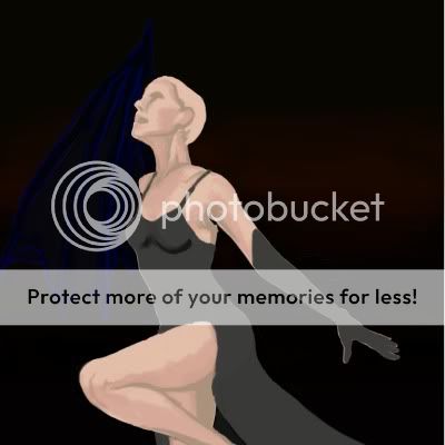
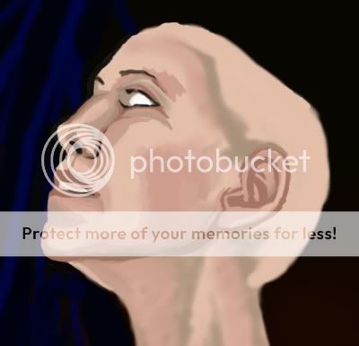
Welcome to Gaia! ::

The Conspiracy

Back to Guilds

A casual guild, with a lot of events and practices aiming for World Domination. 

Tags: Plotting, Conspiring, Events, Manga, Stalking 

Reply Tutorials and Critique
Zen's CG realism tutorial that hopefully makes sense

Quick Reply

Enter both words below, separated by a space:

Can't read the text? Click here

Submit

EmperorZensekai
Captain

Blessed Visionary

10,325 Points
  • Happy 13th, Gaia Online! 50
  • Beta Contributor 0
  • Bunny Hoarder 150
PostPosted: Mon Aug 03, 2009 4:02 pm


As requested I'll be making one of these.

It should work in most blendy art programs, maybe not Photoshop, probably not GIMP.

I'll be using Pin's commission as an example.

I fail at explaining everything I do because a lot of it is more of feeling than technique, especially in faces.

the size of my canvas in this pic is 3000 by 3000 pixels
PostPosted: Mon Aug 03, 2009 4:19 pm


Step 0: Gather your crap

Before I can even start I have to search for references for BG and the person.
I pick the BGs depending on my level of skill and how much somebody paid for the commission. If it's just a pic for myself or randomness that no one paid for, I might be more daring to attempt something I don't know how to paint.

Your person has to be a RL person, anime is essentially useless for a reference.


realism people floating without a BG look weird to me, so that's why I use one most the time
If you don't have one, use a higher lighted photo for a reference.

Lighting should dictate what refs you use unless you've mastered this already.
Don't pic a picture of a human at night if your BG is going to be outside in teh day time, vice versa.


If you're using this tutorial, you probably ought to match the lighting as close as possible.
Factor in the color mood of the references too, often photographers will use colored lighting for moods, if you use a cold lighted picture of a person that's a model and put it to a natural photo BG or something it might come out weird.

picking references is a pain in the a** and there's red tape to go through if it's a stock and you're doing a commission.

Avoid using someone's photography from the net as much as possible unless it's in a book you've bought or a photo you took yourself.

it doesn't matter so much if your pic looks nothing like the reference, but if you do your job right and the face is clearly recognizable, then you are better off using something you're sure no one will claim you stole.

Not many people will actually care that you used something for a reference as long as you don't sell it for money or gold.
If you are selling it, be paranoid.


ok With that in mind

I'm using this for a BG

User Image

I dunno who took this, I didn't, but when I'm done using it, it's not going to really resemble the photo enough for it to matter, and I'm not painting over the photograph, I'm eyeballing any reference to it.

Never paint over anyone's photo unless it's yours or you're just doing a fooling around picture for yourself.

I should therefore be using a picture like this for a person, because the lighting would be similar

http://i82.photobucket.com/albums/j255/EmperorZensekai/Featured_June_05___Dove_Stock_by_Fu.jpg

page stretch of doom

But the stocker says no use for commercial purposes, and this is a commission....

So I'm using this one where the stocker said anything was fine to use it for, and I failed at finding something similar to the first one.
User Image
notice the lighting is lighter, but I'll be able to tweak it how I want to because I'm me.

EmperorZensekai
Captain

Blessed Visionary

10,325 Points
  • Happy 13th, Gaia Online! 50
  • Beta Contributor 0
  • Bunny Hoarder 150

EmperorZensekai
Captain

Blessed Visionary

10,325 Points
  • Happy 13th, Gaia Online! 50
  • Beta Contributor 0
  • Bunny Hoarder 150
PostPosted: Mon Aug 03, 2009 4:29 pm


Step 1: blobs

Always know or at least have a clear idea of what you're painting before you start painting in this style lol. If you make up stuff half way through, chances are it'll look weird.

Don't use lines as much as possible. Lines are for when you don't know what something's going to be.
If you're texturing cloth or rock or something using lines, that's different, but black outlines are for cartoons only.
This is done in layers of color.

use high opacity as much as possible.
low opacity is really blurry.
Avoid using the blurr tool.

User Image

start with 100% opacity
first I put down the BG color, eyeballing as much to the color of the photo which was a really dark yellowy black.
After that I put some full black on teh bottom of the pic to contrast with the lady going to be there.

After that, I made the blob of grey pink lady. She's part grey because it's a dark lighting.
I eyeballed her form to the best of my ability and moved her where I wanted her on the canvas
I cannot explain how I did her shape accurately, it's a good sense for feeling the picture's contours and bringing it over. It's a honed skill.

Once lady was done, I used 1-3% opacity and painted in the red-orange dark horizony color streaks in. That'll end up being some of the light coming off the city.
lag made those take forever.
PostPosted: Mon Aug 03, 2009 4:46 pm


Step whatever

Make a new layer

Well you have your person and the BG, so time to start detailing.

Pick a dark color and a skin tone color for your person and begin adding in some feature as well as the bottom layer for your clothes.
I used 36%-45% opacity for that, but the higher you can control the better.
might be better to start with 25% if you're not used to using areas of color.

User Image

Do not outline and sketch with lines.
You'll argue no doubt the shadow on the leg and jaw I have is an outline, it's a shadow and an area of color--not a line.
you'll see pink "outline" on the gloves and body, that's not an outline, that's just because I was lagging and I got tired of spamming the undo button in order to color all the pink over.

for this picture I DO have an outline for the wing in blue, that is because the wing is nearly the same color as the BG and I needed to remember where it was.
The wing is going to be black with glossy blue, green a purpley scale shines.
I'll get rid of the outline as I color that in.

EmperorZensekai
Captain

Blessed Visionary

10,325 Points
  • Happy 13th, Gaia Online! 50
  • Beta Contributor 0
  • Bunny Hoarder 150

EmperorZensekai
Captain

Blessed Visionary

10,325 Points
  • Happy 13th, Gaia Online! 50
  • Beta Contributor 0
  • Bunny Hoarder 150
PostPosted: Mon Aug 03, 2009 4:51 pm


Step 2: Sketching

Ok so after doing that, you should use 25% opacity or as high as you can control to detail some of the face and clothes in. I use 36%.
Use a hard brush, airbrush will blurr the pic to hell at this point.
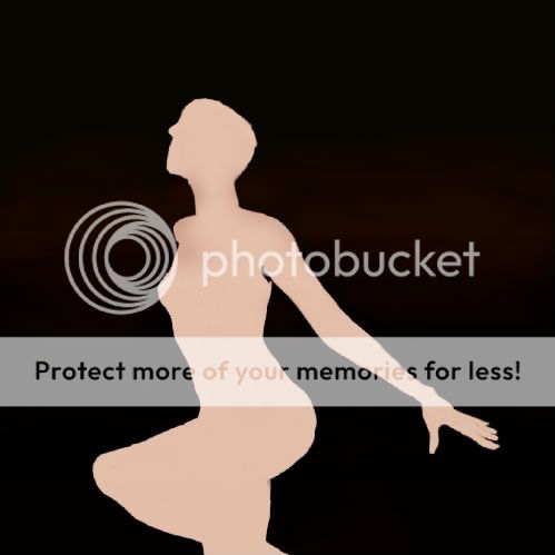
Also go back and reshape your blob person shape if you have to. I end up finding I was 75-80% accurate most the time and have to change around proportions.
I had to fix the face and boobs and knee in this one.

do the hair after your face is done, and do the hair on a new layer in case you have to redraw it. Best to do the head and chest on one layer, and the other skin on another, and then another for the clothes, that way it's easier to keep track.
Save constantly.
Once you get the person sketched out, then do the BG

It's better that you don't use splotches, because you'll need about a dozen colors and in the next part it's easier to just pull colors form what you've already painted.
It's easiest to eyeball colors and pick them fast (which is why I hate PS) because you'll probably be changing colors every minute when we get to a further step.
I don't suggest pulling colors from your reference, because you don't want it to look like you painted over it, and you can probably make your pic look better blending colors together without using the already blended colors in the picture on yours.

User Image

it looks pixelly because the resize did a weird job on it....
I have some zoomed in pics so you can see what I mean by working in areas of color.

User Image

It's all blobs.
User Image

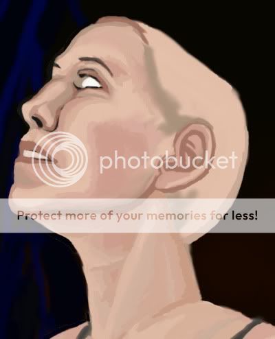
Don't waste your time smoothing out the edges or putting a perfect scale of color everywhere, you'll fix that later and if you do it now you'll blend it into mush and make it harder on yourself.
Pick the large areas of shadow on the pic, and work with those as well as middle colors... I used maybe about 4-5 on the face, and 3-4 on the neck.
You don't have to use the same colors all over the body, because different parts of skin have different colors.

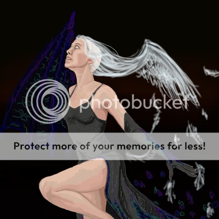
I use airbrush for the hair, since the hair strands you can see through, airbrush is good to start with.
PostPosted: Thu Aug 06, 2009 11:57 am


The Beauty of CG: delete layer lol

ok since I did that section, I decided that my pic looked better without a BG, so I deleted the city. There's enough detail in the lady to make up for it.

I also forgot to say that I intended to cover the dress in white lace, so I didn't have to detail it as much as the skin.

User Image

That's my finished sketch.

notice I changed the clothes with the same colors as the wing...


That's because teh wing was a blind spot.
A blind spot is a spot in a picture that you cannot look at while looking at the rest of the picture. It doesn't register in your mind, unless you look only at it. They are bad.
To fix this I had to tie the colors in the wing to a spot on the lower right of the picture, that's why I did that.
This makes balance in a picture, balance is important in the composition of the picture. Too much crap or unmatching stuff and your composition will look unprofessional.

do not use this pic as an example of composition= mine is bad lol

EmperorZensekai
Captain

Blessed Visionary

10,325 Points
  • Happy 13th, Gaia Online! 50
  • Beta Contributor 0
  • Bunny Hoarder 150
Reply
Tutorials and Critique

 
Manage Your Items
Other Stuff
Get GCash
Offers
Get Items
More Items
Where Everyone Hangs Out
Other Community Areas
Virtual Spaces
Fun Stuff
Gaia's Games
Mini-Games
Play with GCash
Play with Platinum