Hey, another inker! I hate coloring, too.
I think that
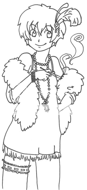
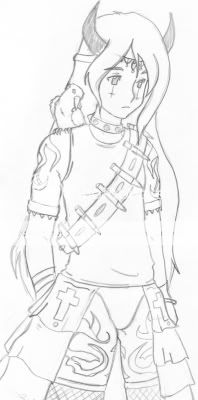
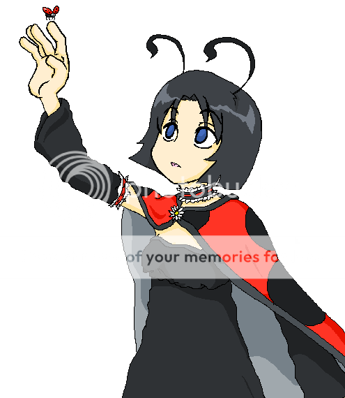
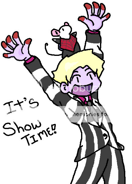
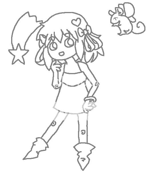
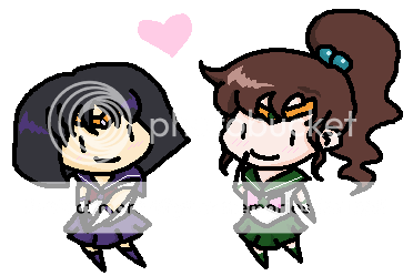
this is definitely your strongest drawing in terms of technical skill. You've got a good eye for volume and rhythm.
Your art would be much easier to read if you added
line variation to direct the viewer's eye and add interest. Doing so would also help improve the concise rhythm you've built using the characters' outfits.
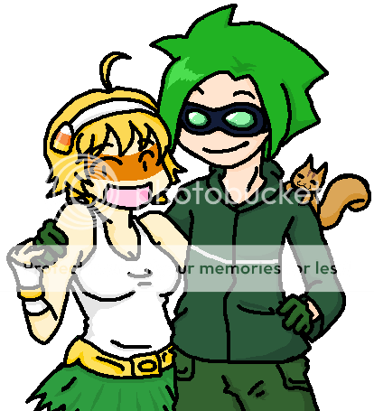
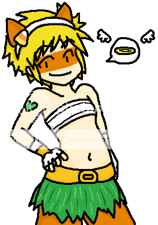
I don't have much to say in terms of anatomy. You seem to have a handle on what you can and can't distort while keeping the figure aesthetically pleasing. My only crit is that it is a little hard to discern between the males and females-- the hip:waist ratio appears to be about 1 in both genders. I'm a fan of androgyny when it suits the character, but I'd just like to be sure that you intended for them
all to be androgynous. If you didn't want them to be feminine-looking, broadening the males' shoulders to form a V-shape would do wonders.
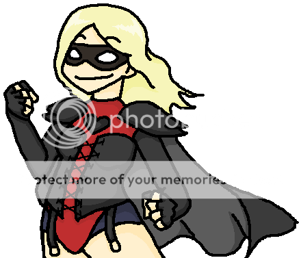
As for females, a waist:hip ratio of .7 is ideal. I wouldn't worry about it too much in the drawings you've displayed (since it's quite clear that
this is supposed to be a flapper).
Otherwise, good job.