|
|
|
|
|
|
|
|
|
 Posted: Sat Jan 21, 2006 8:58 pm Posted: Sat Jan 21, 2006 8:58 pm
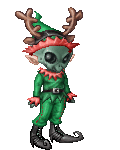
Hello, this is my newest avi so I just wanted to know what everyone thought...XD...yeah. There it is *points* Criticizism(sp) would be appreciated.
|
 |
|
|
|
|
|
|
|
|
|
|
|
|
|
Posted: Sat Jan 21, 2006 9:22 pm
5/10
Don't take the 5/10 meaning it sucks, it just dosin't stand out much, so its average. ^^
The hair though, woahs. o.o I'd either change the color to a lighter color or get some black pants. 3nodding Other than that, I think it is exelent.
Could you rate my dream avi, please? (one in my siggeh)
|
|
|
|
|
|
|
|
|
|
|
|
|
|
|
|
|
|
Posted: Sat Jan 21, 2006 9:44 pm
|
|
|
|
|
|
|
|
|
|
Posted: Sat Jan 21, 2006 10:03 pm
 Does that one look better? My ultimate goal on Gaia, though I doubt it will happen.
|
|
|
|
|
|
|
|
|
|
|
|
|
|
|
|
|
|
Posted: Sun Jan 22, 2006 1:07 pm
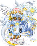
Current: 5/10. Mink looks like crap against all the pure whites, while the hair could easily be tied in and help to break apart the white blob that is your avatar. A black belt and maybe some black shoes could easily do this, and improve the overall look and feel of your avatar ten fold. You may also want to try and get some white on the upper head through a hat or accessorie like the white punk band. Isn't it sold in moria's shop or something like that?
First dream: 4.5/10. Donation item overload. The ninja band looks extremely out of place, while all the blues just come from donation items. Boring and uncreative. Meanwhile, the golden bits of the angellus items seems totally ignored, which is not a good thing to do. Adding some simple gold accessories would help to even this out.
Second dream: 3.5/10, as with the earlier one it's just donation item overload. Too many don't make a good avatar, especially when they're all clumped together. Try to remove a few, use some store items, and tone it down a bit. Spread out colors, don't just clump them all together in the same spot. Also, if you're going to spend that much on donation items, you might as well get a hair style that's actually black. The navy just takes away from it.
|
|
|
|
|
|
|
|
|
|
|
|
|
|
|
Posted: Sun Jan 22, 2006 1:36 pm
6/10 It's very monotone. Add some color into it and try and make it stand out! =D
|
|
|
|
|
|
|
|
|
|
|
|
|
|
|
|
|
|
Posted: Sun Jan 22, 2006 4:47 pm
4/10
it's too white.
except for your hair, which stands out like a sore thumb.
|
|
|
|
|
|
|
|
|
|
|
|
|
|
|
Posted: Mon Jan 23, 2006 6:22 pm
Can someone rate moi?
Its kinda random looking...
That how I wanted it to be.
biggrin DD
|
|
|
|
|
|
|
|
|
|
|
|
|
|
|
|
|
|
Posted: Mon Jan 23, 2006 9:15 pm
it's a nice start to a white avi. the mink doesn't really match though. x3
you could try getting angelic shiny stuffs or picking another color to balance the avi out more.
|
|
|
|
|
|
|
|
|
|
|
|
|
|
|
Posted: Tue Jan 24, 2006 6:32 am
It's simple and classy. 7
|
|
|
|
|
|
|
|
|
|
|
|
|
|
|
|
|
|
Posted: Tue Jan 24, 2006 7:36 pm
Well I am now working on a new one so yeah...selling some stuff to buy some stuff... I am taking everyones tips into consideration realy heavily right now...
|
|
|
|
|
|
|
|
|
|
|
|
|
|
|
Posted: Sun Mar 26, 2006 4:39 pm
So far, it's a 7-10. You need a shirt soon X3 That or more red. X3
|
|
|
|
|
|
|
|
|
|
|
|
|
|
|
|
|
|
|


![[-Interesting Indeed-]'s avatar](https://a1cdn.gaiaonline.com/dress-up/avatar/ava/9f/c2/61570e20cc29f_flip.png?t=1463697265_6.00_01)

![[Dill]'s avatar](https://a1cdn.gaiaonline.com/dress-up/avatar/ava/aa/4c/69947b6b164caa_flip.png?t=1428683666_6.00_10)