|
|
| Basic rating of BOTH Pictures! (more importantly, the secound one) 1 is best, 5 worst |
| 1 *laughs* |
|
21% |
[ 3 ] |
| 2 |
|
7% |
[ 1 ] |
| 3 |
|
42% |
[ 6 ] |
| 4 |
|
28% |
[ 4 ] |
| 5 |
|
0% |
[ 0 ] |
|
| Total Votes : 14 |
|
|
|
|
|
|
|
|
 Posted: Mon Dec 18, 2006 2:58 pm Posted: Mon Dec 18, 2006 2:58 pm
Secound and third pictures farther down!!!Here, i drew a picture of the horse i ride *not relly mine, i rent* so i drew this for my riding teacher... i just want to know what people think so i can improve in future... i mean compared to a real horse, i Know it looks a little to muscular and bulky... any thing else? Thanks ^_^ *sorry about my bad spelling* 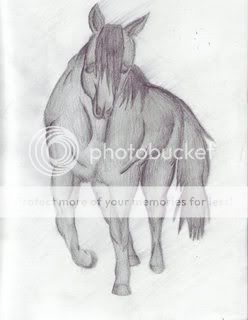
|
 |
|
|
|
|
|
|
|
|
|
|
|
|
|
Posted: Mon Dec 18, 2006 9:49 pm
It's kind of twisted o_O;;
The shoulders are wayyyy too wide, and the muscles too twisted. The limbs are too short, the tail misplaced (should be farther behind the butt)
The face is just odd... learning to draw a horse's head in profile is much easier. Have the neck twsit around, so much easier.
In fact, seeing as you look a bit... newER to the world of drawing horses, a side view is much better to work off of 3nodding so much easier (see my sig... I did that in ten minutes, tops)
|
|
|
|
|
|
|
|
|
|
|
|
|
|
|
|
|
|
Posted: Tue Dec 19, 2006 7:53 am
I must agree with what Mel says. Another thing, it seems to me like the eyes are to far down on the nose. The left shoulder is to far out to. But, I must say that it is relitivly good. Better then many drawings I have seen. ^^
|
|
|
|
|
|
|
|
|
|
|
|
|
|
|
Posted: Tue Dec 19, 2006 10:07 pm
Well, he is indeed quite a muscular fellow, isn't he? wink
I think that a frontview angle is rather difficult to tackle at first, and would reccomend becoming familiar with horses from the side view first. However, it is nice to see a horse with some muscle on him, even though it appears he has taken one too many steriods shots. XD The shading is nice, but don't forget to have more value changes - some pure white spots where the light source is brightest, and some black spots where he is farthest from the light.
With some more study of proper horse proportions and anatomy, I think you will bve able to draw wonderful equines. biggrin
|
|
|
|
|
|
|
|
|
|
|
|
|
|
|
|
|
|
Posted: Wed Dec 20, 2006 3:58 pm
Thanks everyone... ill post anouther picture later, i drew him jumping. havent had time to post it yet. i know this one isint great... but thats only the 4th time ive ever drawn a horse... and i uasualy draw anime/manga stuff... so its hard for me to switch from that to realisistic! *Sorry about my bad spelling*
|
|
|
|
|
|
|
|
|
|
|
|
|
|
|
Posted: Wed Dec 20, 2006 4:24 pm
Ok! this is the 5th horse ive ever drawn XD i think its better, this one at least isint on steroids! Lol. so what do you think? its suposed to be a self portrate *thats suposed to be me but im RELLY bad at drawing people from the side... so yha... * i KNOW his feet are about to hit the jump... but, i had alot of troble drawing his feet, so i wanted to use the jump to cover them up! Lol so please comment, thanks. 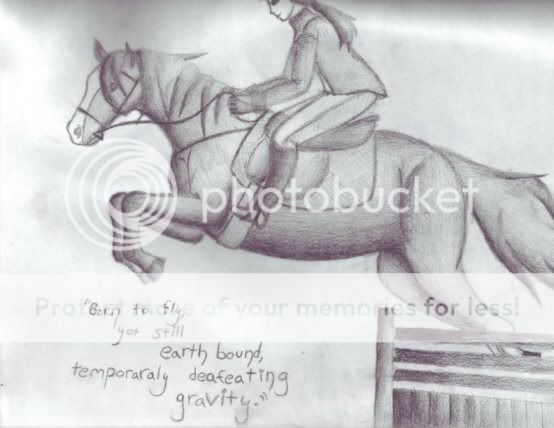
|
|
|
|
|
|
|
|
|
|
|
|
|
|
|
|
|
|
Posted: Wed Dec 20, 2006 4:50 pm
Ooh! This is much better! His body and legs look good, and his chest is nice. The rider looks pretty good too! Riders are tough - I avoided drawing them for many years! xd You can make sure the rider is in proper position by drawing a little stick 'skeleton' to lay out the base for your sketch. Her legs are a bit too far forward, but her arms look good.
The horse's face looks much better, but remember that the mane does not lie flat against the neck when the horse in in motion (but the tail looks good, if a bit thick). And don't forget that bridles and breastplates are strips of leather - not strings. smile Pay attention to the little details, and I think you'll be on your way!
|
|
|
|
|
|
|
|
|
|
|
|
|
|
|
Posted: Wed Dec 20, 2006 8:57 pm
MUCH better ^_^
You captured the idea of a horse's body structure this time, and it looks fairly good! There are a few things, though:
One, you forgot a joint in the back legs. Where are teh hocks?!
Two, shift the saddle forward, so that the girth isnt slanted like that. Also, draw the rider's calves back, and the rest of the body forward. The reins shouldn't be slack, either, the rider should be holding them firmly.
Three, the bridle shouldn't slip down like that.
Four, Move the front of the hips (the flanks, basically) more forward
Five, make sure you dont make the horse's belly completely round, or the horse will look fat.
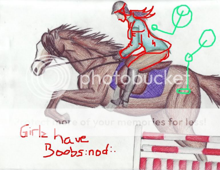
I did a draw-over for you on MS paint to help you see what I mean, a bit, plus more suggestions ^_^
Anatomy corrections in red, tack corrections in blue. 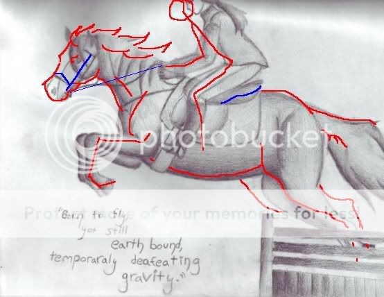
|
|
|
|
|
|
|
|
|
|
|
|
|
|
|
|
|
|
Posted: Sat Dec 30, 2006 3:06 pm
YAY! guess what? i gave them to her, she sent me a thank you card saying she liked them alot! i thought, ah shes just being polite... at my lesson today, she says "i put the picture's you drew on my refriderator, i know there not refriderater art, but its a remidner for me to go buy them a frame at michles" i was like... litterly slack jawwed... LOL biggrin i thought ... imean, her husbound is an artest, i dident think she'd like them THAT MUCH! LOL biggrin *there is one colored picture i dident scan or put up, i think thats her favorate, she was talking about how the coloring was diffrent than that of her other horse, so she knew it was elmo... and also, she said i drew him sturdy in places it feel's like he's sturdy when your on him. I dident knowtis i did that... i just... uncontiously did i guess! LOL
|
|
|
|
|
|
|
|
|
|
|
|
|
|
|
Posted: Sat Dec 30, 2006 7:51 pm
Good job ^^ Maybe you could photograph the drawings?
|
|
|
|
|
|
|
|
|
|
|
|
|
|
|
|
|
|
Posted: Sun Dec 31, 2006 5:35 pm
That one she has at her house, doubt ill see it again lol, and the one im working on now, (the jump in colored pencil) ill scan when its done... is that what you ment? confused
|
|
|
|
|
|
|
|
|
|
|
|
|
|
|
Posted: Mon Jan 01, 2007 6:55 pm
New Picture!!! biggrin biggrin biggrin well not relly, its the same as the sketch, exsept i tried to fallow what everyone said, and its colored! ^_^ 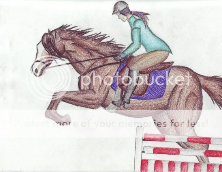 the scaner seams to hate me though... it messed with it xD
|
|
|
|
|
|
|
|
|
|
|
|
|
|
|
|
|
|
Posted: Mon Jan 01, 2007 7:34 pm
^^ here's some corrections to keep in mind.
As for shading, it's good for starting, but chose a light source (example, coming from the "sky" of the drawing) and shadow places that the sun wouldnt hit darker. Also dont be afraid to put dark colors against light colors if shadowing calls for it. Use refference pictures ^^
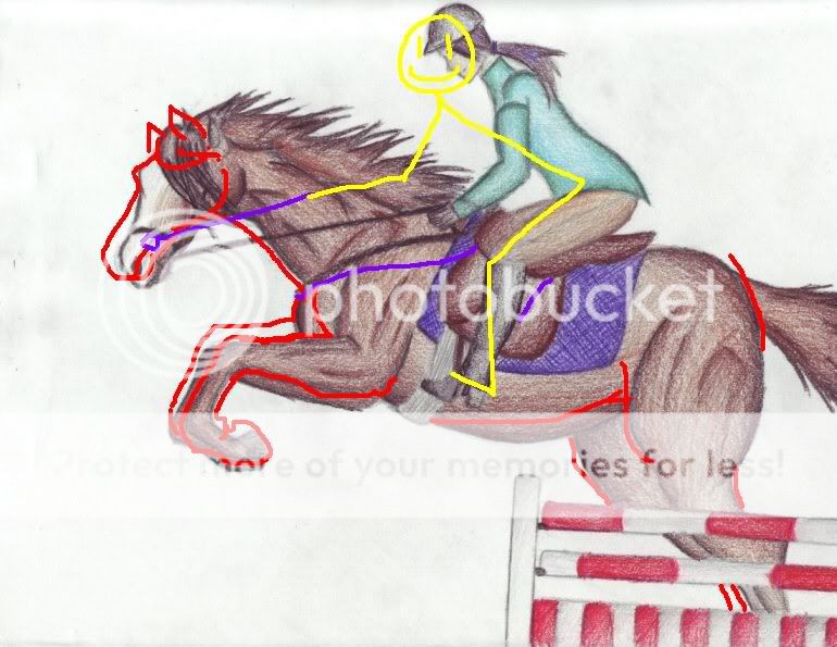
The green stick-person is an outline I use for drawing people on horses.
Also, even really muscular horses dont have that sharp of muscle, and jumping horses are bit more slender, generally, and smooth.
(also can use these pics as shadow refferences, and decide what colors to use. For example, in this first one you can use black, brown, gold, tan, and yellow) (ALSO note possition of rider, because the corrected possition was just a guess for me. I'm no English rider)

This one you can blend greys and whites in with the brown (this is a very muscled horse, note the difference in its neck and the neck your drew in coloring, muscles, AND shape)
Simple drawing/shading/coloring
Another very muscled jumping horse, NOW note the pinch in the muscles at the flex of the neck... it's not muscle shape, simply pinched skin. Compare to your drawing.
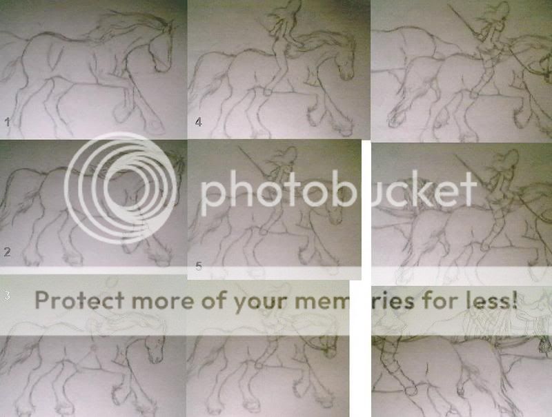
Other than this, you might want to start with stick figures, draw the horse first, and then the rider, and then the tack. This is one of something I just drew today, and randomly took progress pics, but you can see how I did it, and how it progresses. It might help XD
The disproportions shown are just because of the webcam. I'll post a picture of it when I get it scanned.
|
|
|
|
|
|
|
|
|
|
|
|
|
|
|
Posted: Mon Jan 01, 2007 7:38 pm
rofl I just saw that the last frame in the last picture is backwards.
|
|
|
|
|
|
|
|
|
|
|
|
|
|
|
|
|
|
Posted: Mon Jan 01, 2007 8:01 pm
Here it is X) Simply to see, and it's grat for muscle refference, even though it's draft warhorse vs jumping horse lol. All of them have the same basic shape and muscle structure. 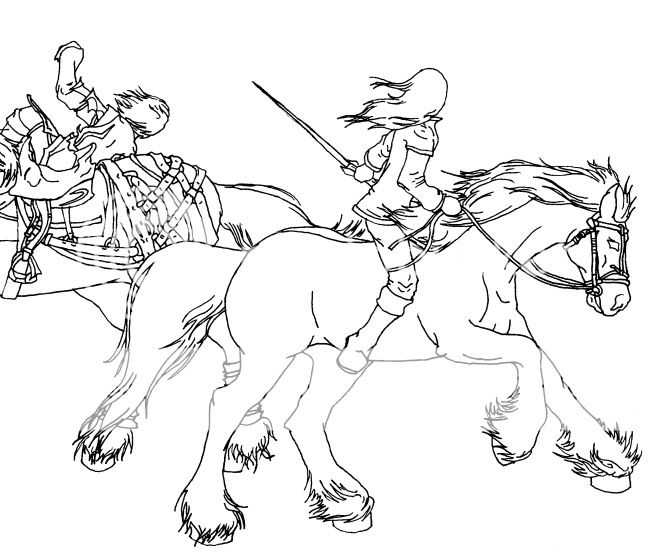
|
|
|
|
|
|
|
|
|
|
|
|
|
|
|
|
|
|


![x.Marsh[mel]low.x's avatar](https://a1cdn.gaiaonline.com/dress-up/avatar/ava/26/30/dee94593026_flip.png?t=1428002944_6.00_11)