|
|
|
|
|
|
|
|
|
 Posted: Mon Jan 08, 2007 5:09 pm Posted: Mon Jan 08, 2007 5:09 pm
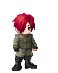
Vandal This is a picture I did for someone, please critique. ~Chu
|
 |
|
|
|
|
|
|
|
|
|
|
|
|
|
Posted: Mon Jan 08, 2007 5:39 pm
Pretty good! I like the red in the wings, but what I like the best is the background. It's very sharp and the highlights fromt he building and on the water are amazing. The eyes, too, are wonderful with their two tones, as are the very detailed guns.
I only have one suggestion: Since everything else is so clear, try outlining the boy, just as if he were a line art. It will add an extra element of clarity and tie the entire picture together in addition to covering up any fuzzy lines or small errors. Thanks for posting!
-Aurah
PS. You did fine with posting it. Thank you! ^_^
|
|
|
|
|
|
|
|
|
|
|
|
|
|
|
|
|
|
Posted: Mon Jan 08, 2007 6:30 pm
I have to agree with Aurah. It looks pretty good! But some outlines would make some improvement, since it's strange that the background is more focused than the foreground. Also, they'd cover up the little white pixels that escaped the brush on the wings and such.
Keep up the good work! ^^
|
|
|
|
|
|
|
|
|
|
|
|
|
|
|
Posted: Tue Jan 09, 2007 1:52 pm
The hair... The sky... The water... So pretty.
I don't really care much for the actual person in your picture, but he's still fairly well made. And what's the orange glowy thing and gun in the corner for?
|
|
|
|
|
|
|
|
|
|
|
|
|
|
|
|
|
|
Posted: Wed Jan 10, 2007 1:46 pm
Ooh. Guns.
Darn it, Aurah and Padawan already said what I was going to suggest. <<;
Great job on the shading of the hand, though. It almost looks too realistic for the picture.
|
|
|
|
|
|
|
|
|
|
|
|
|
|
|
Posted: Sun Jun 24, 2007 6:02 am
ummm. the browser wont let me see the pic, so...good job? neutral
|
|
|
|
|
|
|
|
|
|
|
|
|
|
|
|
|
|
|