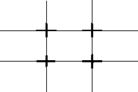
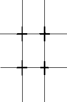
Even More Information on Composition!Borrowed from DeviantArt NewsFilling the four corners of the frame raises the compositional bar, asking one to not only isolate the subject, but to use the frame as efficiently and as powerfully as possible. On page 7 of The Art of Photographing Nature, the authors discuss the specific task of filling the four corners of the frame. Editor Martha Hill suggests that this is simply working within the space dictated by the rectangle of the viewfinder. A simple concept, but it’s not easy to do, especially when the subject is in motion.
The bottom line: good composition is a matter of awareness. Try as best you can to be conscious of your entire frame. You’re looking, of course, to fill the frame with content, but also with design and visual flow. Photographers who can do this juggling several important intellectual tasks at once and getting it right can be confounding to beginning photographers. Strong composition, though, is a fundamental necessity of professional work. Hint: practice makes perfect.
Composition is how we structure a picture to be coherent and lovely. Like the skeleton that is brought to life by the muscles and ligaments attached to it, composition is the unseen structure that gives strength to the photographic statement. If it is strong, lyrical, and clear it has the power to move others. The photographer, like the brain that directs the whole synchrony of elements, is the soul breathing life into the inanimate. (16)
Qualifications for Well-composed images
(1) Framing—Where to place the Subject- This should be your first consideration when trying to make a photograph. Afterwards, you find its relationship to and with other elements. Subject placement also has its ramifications for the ultimate use of the photo as well. Subjects have a ‘visual weight,’ in other words a certain importance or position. When this weight it out of balance (too high, too low, too close to an edge, etc.), many find the effect jarring.
(2) Format: (Horizontal or Vertical?)- There are situations in which both formats are equally valuable and as a photographer you should be aware of that. Each one is valid, yet says different things. Vertical usually puts an emphasis on tall, slender things, whereas a horizontal gives more of a sense of place. Finally, if you plan to publish your pieces, room for cropping is needed. This is why it is important to have both horizontals and verticals for maximum flexibility. Magazine covers use verticals most of the time and need room to place their title and articles within a magazine may call for a certain image size and shape.
(3) Framing—Cropping- Where an image is cropped within the frame can make a significant difference in how a subject looks. “By selecting certain subjects to lie within the frame, you make a statement about them and create a balance of elements. If those elements come in contact with the frame, or are intersected by it, you need to evaluate what this does to the overall balance.
(4) Symmetry vs. Asymmetry- Up until the Renaissance, the tradition of Western art was dominated by symmetry (subject within the center). This was mainly due to religious paintings- they extended upward or downward, from a central figure. Symmetry is a form of centeredness, based on a central line. An implied balance between either sides of the line gives us equilibrium. Symmetrical compositions emanate tranquility and stability, while asymmetrical composition shifts emphasis to one area over another. Asymmetry does require a balance to be restored. Since we experience gravity, we look at the world with a subconscious assumption that everything falls to the ground (things lower in the frame appear naturally weighted toward the earth).
(5) Center of Interest- This does not mean the subject should be in the center. A poorly composed photo allows the viewer to wander outside the photo or even feel out of balance. Also, photographers sometimes make the subject too small or too large in relation to other elements, which in return skew meanings. There are still times when putting the subject in the center makes a powerful statement. As long as it is the most interesting part of the picture, it is appropriate.
(6) Integration- Utilizing all the elements “into a series of rhythmic relationships to form an artistic whole.” You are searching for the right combination within the viewfinder. At the same time, you need separate the pieces which work well together, as a whole. The Golden Mean (an ideal ratio the Greeks created; the perfect spatial proportion for sculpture and architecture; mathematically close to a ratio of 8:5). It is not exactly what people call “rule of thirds,” but the idea is same.


