|
|
|
|
|
|
|
|
|
 Posted: Thu Apr 26, 2007 2:57 pm Posted: Thu Apr 26, 2007 2:57 pm
Hi again everybody, now just let me remind you I'm no pro at drawing horses as I said in my previous thread, but please, I welcome all comments and constructive criticism you may have for me. Just know that most of these are works I drew quite a while ago (6th grade+), so I'm a better artist now (10th grade). smile Oh, and sorry a lot of these are kinda blurry cause my camera sucks, but here they are! ^^ The Sunchaser, a book character unicorn I drew in 6th grade, but my Dad helped me so not entirely mine but still proud of it! ^^ 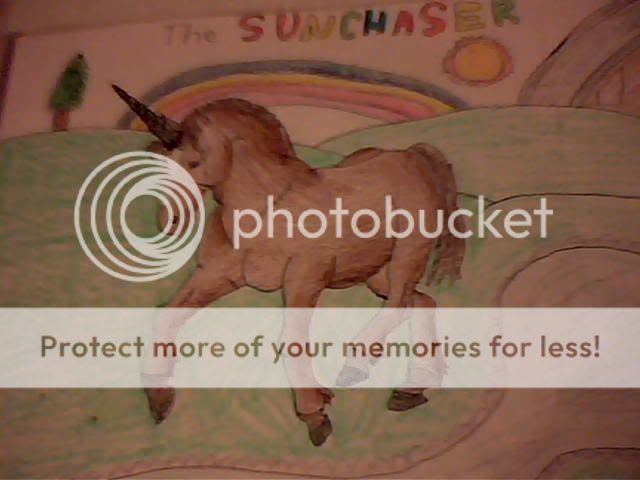 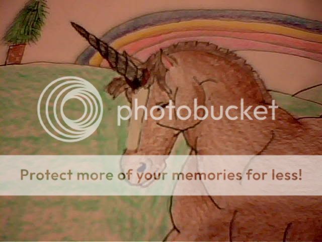 Moonrise, a horse on a book cover I drew, and many of these following drawing are as well (drawn in 6th grade). 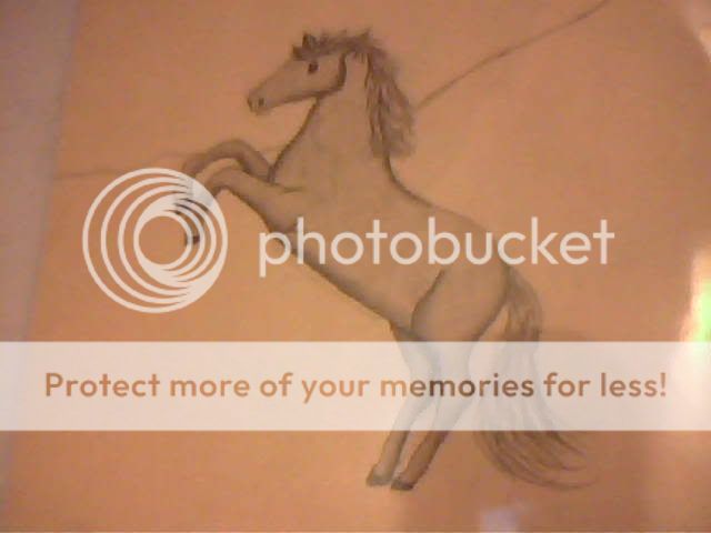 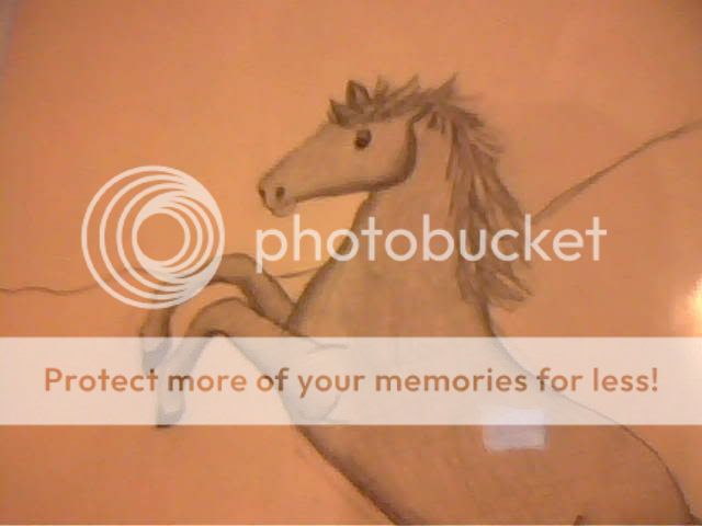 The Phantom, also a book cover drawing (6th grade). 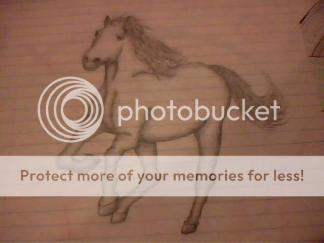  This one I drew off the background on my computer desktop image. ^^ (8th grade).  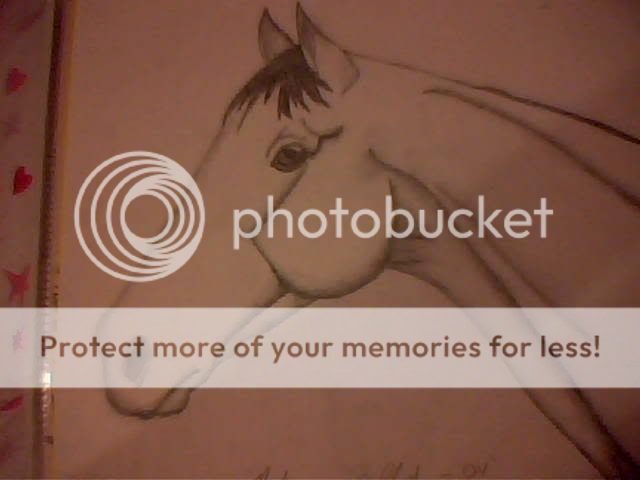 And this I drew during summer school when I got bored, lol. From the cover of my homework folder. One of my favorites ^^ (9th grade). 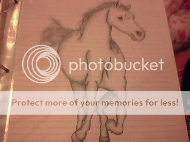 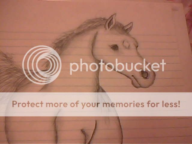 And FINALLY I did this one today in class (10th grade). It's kinda blue cause it was kind of dark when I took the picture, but I'll show you a clear headshot of the pic later. ^^ 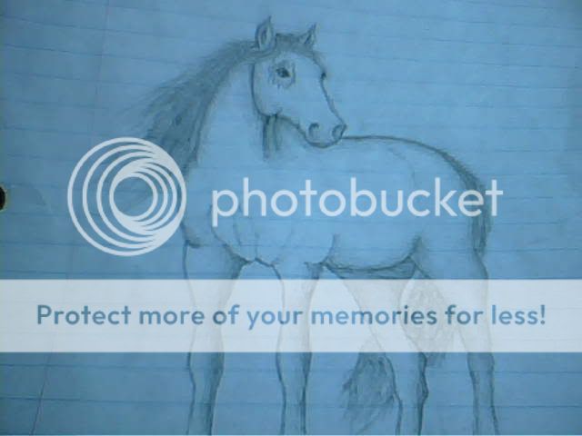 ...Comments? Criticism? Let me know what you think! heart sweatdrop
|
 |
|
|
|
|
|
|
|
|
|
|
|
|
|
Posted: Sat Apr 28, 2007 3:07 pm
Aha! I finally got the headshot for that last pic of the "blueish" horse: 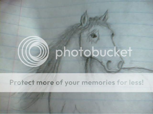
|
|
|
|
|
|
|
|
|
|
|
|
|
|
|
|
|
|
Posted: Sat Apr 28, 2007 3:10 pm
Oh, now, come on people! You've gotta have SOMETHING to say to me...Wether commenting or criticising, I know you want to say something...
|
|
|
|
|
|
|
|
|
|
|
|
|
|
|
Posted: Sat Apr 28, 2007 6:17 pm
Well I'm no expert, but I can give a few pointers on what I see. smile
Try and study the legs a little bit more, some of yours need a bit of work. Look in magazines, in pics online, etc. Try and copy them. A little more detail in the legs too, with muscles, tendons, and more correct joints and the placement of the joints, would be really good.
Also, in some of them, the legs are a bit too skinny, the horse looks too bulky on kinda stick-legs.
|
|
|
|
|
|
|
|
|
|
|
|
|
|
|
|
|
|
Posted: Tue May 01, 2007 4:20 pm
Oh, okay. Yeah, I always have trouble with the legs and the face. But I didn't do too bad on the face this time. ^^
|
|
|
|
|
|
|
|
|
|
|
|
|
|
|
Posted: Thu May 03, 2007 5:44 pm
tempest_foal Aha! I finally got the headshot for that last pic of the "blueish" horse:
xD -huge Phantom Stallion geek-
They look pretty good, keep up the good work. Try and add some muscle definition, they look pretty flat. ;p
-s.p.a.d.e
|
|
|
|
|
|
|
|
|
|
|
|
|
|
|
|
|
|
Posted: Wed May 30, 2007 5:13 pm
Yep, love the Phantom Stallion books! heart So I'm always trying to draw the horses on the covers, and I'm usually pretty good. ^^
|
|
|
|
|
|
|
|
|
|
|
|
|
|
|
Posted: Sat Jun 02, 2007 11:06 am
They *are* pretty good, you have talent. The only thing that really needs work is the anatomy. I'm not really that good at in-depth anatomy criticism, but I'll do my best here.
The one that you drew during summer school looks a bit lopsided, I think it might be the positioning of the right foreleg. I was going to say something about muscles and tendons in the legs, but only the first few pics really lack them. I like them all, just work on your anatomy and you'll do great.
Good job =]
EDIT: I love Phantom Stallion too! *jumps about happily*
|
|
|
|
|
|
|
|
|
|
|
|
|
|
|
|
|
|
Posted: Sun Jun 24, 2007 1:50 pm
very nice! overall there pretty good I would just say to work on getting the proportions and shapes more accurate.
|
|
|
|
|
|
|
|
|
|
|
|
|
|
|
Posted: Thu Sep 06, 2007 6:58 pm
scotch megafleet tempest_foal Aha! I finally got the headshot for that last pic of the "blueish" horse:
xD -huge Phantom Stallion geek-
They look pretty good, keep up the good work. Try and add some muscle definition, they look pretty flat. ;p
-s.p.a.d.eOmg I heart heart heart Phantom stallion!!
|
|
|
|
|
|
|
|
|
|
|
|
|
|
|
|
|
|
Posted: Sun Sep 23, 2007 8:54 pm
In a couple of thm the legs were a bit unproportioned (Althought the foal was perfect). All in all you have potential! wink
|
|
|
|
|
|
|
|
|
|
|
|
|
|
|
Posted: Sun Sep 30, 2007 7:28 am
Those... are acutally really nice. You were a much better horse-drawer in sixth grade than I was. XP
Hmm... On the last, "blueish" one, the horse's body is a bit... i guess the word would be thin. Like, the thickness of the body (going vertically) is a little over half of what the legs are. And the legs are a little to thick (going horizontally). But they're really good.
I love the way you do the hair. I suck at manes and tails.
|
|
|
|
|
|
|
|
|
|
|
|
|
|
|
|
|
|
Posted: Tue Oct 02, 2007 3:08 pm
Ok, I can definitely critique these. biggrin I'm no great artist, but I know a good horse drawing when I see one, and I can point out flaws pretty easily.
1st One: The lines you drew to define the jaw look pretty awkward, and all in all, the unicorn is very bulky, especially in the legs. The color change on the fetlocks looks odd. The right hind leg gets thicker, which doesn't look good. The right front leg looks turned to the side a bit too much, make sure to draw it facing straight out from the chest. wink The neck muscles are very awkward looking too, too bulky near the withers.
2nd One: The head is shaped oddly, and the jaw is squarish, rather than round. The mane looks fuzzy and frizzy rather than smooth, make more of the hairs going in the same direction with an occasional few hairs out of place. I like the tail on this time, but it's too long. If it was straight, it would drag on the ground. Make it around the top of the fetlock next time, supplementing for any curves or waves. The joints in the legs aren't visible enough. The hooves are too small. The hip joint on the left looks very awkward. The underside of a horse isn't straight. The neck thickness changes too much from the head to the body, make it get slightly thicker, not like twice as thick. Define more muscle along the whole body.
3rd One: The head is too small, mane looks frizzy again, and the horse looks too muscled in the neck. Both left legs look awkward. The cannon bone on the right front leg is too long. The hind legs look too far apart.
4th One: The jaw bone is defined too obviously, as is the muscling along the neck. Shading would help define muscles without making it bluntly obvious. The ears look small. The head looks too long.
5th One: The mane and tail are frizzy again, the muzzle looks too puffy. The jaw isn't rounded enough. The chest looks really really awkward. The legs aren't straight, the shoulders aren't even. Shoulder blades would never ever be that close. There's more space between them. the left side of the shoulder looks really tilted. Usually hooves don't turn out as much as the right front hoof is. The left front leg would look better if it was bent at the knee rather than the fetlock. The left back leg looks extremely awkward, what is with that bend?! The thickness of the hind legs is hugely different, the left one being more awkward. The ears are too small. The left eye looks awkward.
6th One: The nostril looks really pointed. The ears are too pointed as well. The legs are way too bulky. The mane and tail are frizzy again. His left front leg is skinnier than the other legs. His right hind leg is really awkward looking, two joints? The nostrils are very big, and unless this horse was just galloping, they wouldn't be enlarged like that.
But, despite all my criticism, your drawings are really good. I wish I could draw horses. xd
|
|
|
|
|
|
|
|
|
|
|
|
|
|
|
Posted: Tue Oct 02, 2007 3:49 pm
Wow...Okay, looks like I've got a lot to work on in the future, but thanks to all for the help and comments! ^^
|
|
|
|
|
|
|
|
|
|
|
|
|
|
|
|
|
|
Posted: Fri Oct 05, 2007 1:59 pm
O.o I like those very much! mrgreen Try and add more details like mussels, and individual hairs...may take longer but I promise it will make those all ready great pic's FANTASTIC! lolz sweatdrop xd
|
|
|
|
|
|
|
|
|
|
|
|
|
|
|
|
|
|