|
|
|
|
|
|
|
|
|
 Posted: Mon Jun 04, 2007 9:00 pm Posted: Mon Jun 04, 2007 9:00 pm
You heard me!! This is the place to post art that you want others to LEARN from! ^_^
Sound fun? THAT WAS RHETORICAL!! scream Of course this is going to be FUN!!! scream domokun scream Right...??? NE?! rolleyes ninja burning_eyes eek eek
HAhahahaaaaaaaaaaa.........yeashhhhhhhhh...fun. wink
*ahem*Here's how this works. You submit your own artwork here with your OWN critique of it. This will challenge you to really look at your own stuff with realistic eyes. Tell us what worked well, what took a lot of effort, maybe even what techniques you used- the catch is, you may only submit artwork hear that also has something WRONG with it. WHY?! Well, we will all make less mistakes in the future, if we share them with one another. It may be painful, but after a while you will similar patterns with similar poses, approaches, etc, and this will become a useful and uplifting tool to help you avoid the potholes on the highway of art (because it ain't gettin' repaved anytime soon). 3nodding You will see others doing what you did, and avoid what others have done. ~~~ To clarify!! ~~~
Nothing that is submitted to this thread is to be called names or labeled junk. ALL of it is useful, worthwhile, and we will ALL benefit from seeing it up here. Those that submit are to be commended, and respected for their efforts and contribution. It takes guts to admit you did something incorrectly, and even more to tell us all about it, for the greater good.
That being said, I will start things off here, and remember to keep everything you post within the Gaia tos.
|
 |
|
|
|
|
|
|
|
|
|
|
|
|
|
Posted: Mon Jun 04, 2007 9:02 pm
~~~~~~~~~
Reserved
~~~~~~~~~
|
|
|
|
|
|
|
|
|
|
|
|
|
|
|
|
|
|
Posted: Mon Jun 04, 2007 9:05 pm
~~~~~~~~~
Reserved
~~~~~~~~~
|
|
|
|
|
|
|
|
|
|
|
|
|
|
|
Posted: Mon Jun 04, 2007 9:36 pm
My biggest issue seems to be that I make the heads of the people I draw too large. This is true of about 35% of the characters I draw. i think that when I began drawing I taught myself that the hair could go on forever, or something!  In this one in particular I wanted the head to be a bit larger, ad the rest of the body to taper, as if it were going away in perspective. The theory here was that the feet would be the smallest and furthest away, and that the head would have to be large. What I messed up on was the insane width of the head and the fact that the head doesn't taper or get smaller at the bottom at all. I liked showing the wind in the movement of cloth, but I wasn't consistent all the way around and left out her bangs and braid. I drew them first, and isn't want to put the wind in until I was drawing the dress. I did this sketch in marker (actually in Marvey (sp?), which is marketed as a stamping marker, but some of the colors are great. The drawback to using them is that they are water soluble and can bleed everywhere. One last thing... I didn't draw this in pencil before hand, or the size would have been less of an issue. When proportion is off it shows that the artist didn't spend a lot of time looking at the work as a whole. My suggestion to anyone who has similar issues... every few minutes, look up from your paper, look away for several seconds, then look back at the paper and pretend you didn't draw it. New things will come to light and you can fix them because of it. So, that's it. Huzzah for learning!! Comments anyone? Critiques? Post your own?
|
|
|
|
|
|
|
|
|
|
|
|
|
|
|
|
|
|
Posted: Fri Jun 08, 2007 11:06 am
Err.. I'm not doing full body forms for now, since I'm concentrating on certain stuff, but I still have problems pulling everything together. ^_^; It's kinda messy... sweatdrop
|
|
|
|
|
|
|
|
|
|
|
|
|
|
|
Posted: Tue Jun 12, 2007 8:58 pm
Adeliont- nice to meet you. Charmed! ^^
What is it about your piece that you'd like to point out? Anything in particular? Technique, Color choices? What worked, and what didn't?
|
|
|
|
|
|
|
|
|
|
|
|
|
|
|
|
|
|
Posted: Wed Jun 13, 2007 12:40 am
Originally the hair was supposed to be a little brighter, gradiating from dark purple to blue to the orange of dawn, but it kinda came out murky so I have to be a little careful about the colours I choose. Maybe do a little planning beforehand.
The skin's colour too has to be carefully chosen. It's a little too pale [like a vampire. But he isn't! gonk ], so a little darker colour perhaps. The ear, strangely, came out the best imo, though it's rough with the painting there. Perhaps going with instinct is better. ^~^
It's all on one layer, so I couldn't fiddle with it like I wanted to [was afraid of spoiling it]. Else it would've been better. ^_^ I really need to learn colours better.
|
|
|
|
|
|
|
|
|
|
|
|
|
|
|
Posted: Wed Jun 13, 2007 1:39 pm
Thanks for the details. Was it painted, then? Watercolor, acrylic, or oil?
|
|
|
|
|
|
|
|
|
|
|
|
|
|
|
|
|
|
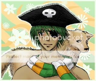
Posted: Tue Jun 19, 2007 7:56 pm
 im not happy with the background and i think i may have put too much of the *lines indicating fur* on the doggie, and perhaps the dog needed to be a different colour...i dunno and the nose of the guy just a teeny bit lower oh and i left out one of the dogs eyebrows in the lineart sweatdrop
|
|
|
|
|
|
|
|
|
|
|
|
|
|
|
Posted: Tue Jun 19, 2007 8:03 pm
thats heaps good Adeliont! ive always sucked at painting, digital or non.
but theeyes seem too close together, remember the eyes are one eye length apart! xD i think the face is sposta be four eyes wide or something too
whatever, keep up the good work!
|
|
|
|
|
|
|
|
|
|
|
|
|
|
|
|
|
|
Posted: Tue Jun 19, 2007 9:34 pm
I think people vary between four and five eyes wide for the face. I personally think four looks a bit better. I didn't think the eyes were too close together in that picture, though. His left, out right eye isn't as big as the patch over it, so there's more than an eye's width between them.
|
|
|
|
|
|
|
|
|
|
|
|
|
|
|
Posted: Fri Nov 09, 2007 5:11 pm
 Hum. Looks like I should start scanning in everything I've drawn the last year or so? Oh well. Here's the most recent one that I've scanned in, and have gotten a start on coloring... which I cannot do for the life of me. -_- Hum. Looks like I should start scanning in everything I've drawn the last year or so? Oh well. Here's the most recent one that I've scanned in, and have gotten a start on coloring... which I cannot do for the life of me. -_-
So.. here's meh drawing after reading the first three volumes of Loveless at once. Bad idea. I was doodling him for so long. xD He doesn't have his bandages in this... and the coloring is really really messy. I've got the .psd file still, and am cleaning it up a bit and filling in bits of the lineart, since I can't do it properly. I bet once I get my new copic liner I'll be able to start it again...
I've got eyes down pretty well... or at least, they're somewhat even. Getting the hair to fall easily was hard, but that's sooo hard to tell in this picture since thresholding it, like I normally do, took it away. That's what I get for not making it darker though. =_=
Hands!! I hate them! It looks horrible ;x; If anyone can suggest good exercises for practicing hands, I'd greatly appreciate it. ^_^
|
|
|
|
|
|
|
|
|
|
|
|
|
|
|
|
|
|
Posted: Tue Dec 11, 2007 9:44 pm
Hmm, I haven't been to this thread in awhile unfortunately, but the best way to learn to draw hangs is to draw your own, MANY times. My bestpractice for this is drawing 10-20 pictures at a time, and giving myself about five minutes to sketch each one. This way, I have no time to second-guess what I'm drawing, instinct takes over, and I'm able to capture it more realistically.
I also use a mirror at times to capture different angles. 3nodding
|
|
|
|
|
|
|
|
|
|
|
|
|
|
|
Posted: Wed Dec 26, 2007 5:54 pm
Frogsnack My biggest issue seems to be that I make the heads of the people I draw too large. This is true of about 35% of the characters I draw. i think that when I began drawing I taught myself that the hair could go on forever, or something! In this one in particular I wanted the head to be a bit larger, ad the rest of the body to taper, as if it were going away in perspective. The theory here was that the feet would be the smallest and furthest away, and that the head would have to be large. What I messed up on was the insane width of the head and the fact that the head doesn't taper or get smaller at the bottom at all. I liked showing the wind in the movement of cloth, but I wasn't consistent all the way around and left out her bangs and braid. I drew them first, and isn't want to put the wind in until I was drawing the dress. I did this sketch in marker (actually in Marvey (sp?), which is marketed as a stamping marker, but some of the colors are great. The drawback to using them is that they are water soluble and can bleed everywhere. One last thing... I didn't draw this in pencil before hand, or the size would have been less of an issue. When proportion is off it shows that the artist didn't spend a lot of time looking at the work as a whole. My suggestion to anyone who has similar issues... every few minutes, look up from your paper, look away for several seconds, then look back at the paper and pretend you didn't draw it. New things will come to light and you can fix them because of it. So, that's it. Huzzah for learning!! Comments anyone? Critiques? Post your own? This may sound strange, but I read that drawing people with large heads means you value intelligence...or something like that lol
|
|
|
|
|
|
|
|
|
|
|
|
|
|
|
|
|
|
Posted: Fri Mar 07, 2008 8:55 am
Yeah... she's too big headed tho, makes me wanna knock her block off! lol.
It's frusterating to not notice something so impactful until three hours into the drawing. rolleyes
|
|
|
|
|
|
|
|
|
|
|
|
|
|
|
|
|
|