This is the logo/watermark I designed and am think of using for my photography business. I need some feed back. What do you think? To plain? Any opinions are welcome, good or bad, so long as you're not beoing mean.
Posted: Mon Jul 30, 2007 10:11 am
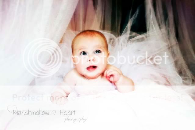
Oh and here's what it looks like as a watermark. xd
Looks good but I feel that the Heart is too far from the Marshmallow... otherwise... it's gorgeous ^___^
Posted: Wed Aug 08, 2007 7:28 pm
Oooh, that is lovely! The only thing that bothers me is that little heart in the middle. I think we get the "heart" idea with the words and the pretty ones on the side... the middle one is kind of overkill for me. Other than that, beautiful choice of brushes and font!
Thank you both so much for your feed back. It's hard to be sure when it's your own creation. I think I deffinetly see what your saying about the heart in the middle. I did go a smig over board there, xd . Thanks again for your input! heart
Posted: Wed Dec 05, 2007 8:58 am
I really like your logo. The way you applied it onto the photograph is alright as well. I voted its ok because it doesnt look bad, but I think it might be a bit intrusive to the image. I personally dont like putting anything on top of my images, if I was to mark them I would set up borders and put my logo or name mark on the border. But this is my personal preference, if you meant to have it this way as a watermark, i think it is fine. Could be a little smaller though. =)